 What Makes A Great Flyer?
We all know that “content is king” when it comes to digital, but when it comes to print, it’s your design that is going to make it most effective for you. Flyer design needs the right amount of information, with enough detail and creativity to make people take notice of it while ensuring that the overall look is clean and uncluttered. The combination of font choice and size, images and colours all impact how effective your brochure will be.
Choosing the Right Font
Fonts tend to come from a couple of key groups or “families”, and each has a specific design intent and helps to evoke particular responses or emotions in your audience.
Serif Fonts: these tend to portray history or heritage and reliability
Sans Serif Fonts: present a clean, contemporary look
Script Fonts: are used to represent elegance and romance or feminine tones
It’s not as simple as saying “we’re an upmarket woman’s beauty business, we’ll use script fonts” because while beautiful and graceful, they can be hard to read if they’re used for large bodies of text. So, you’d use them in a logo or for emphasis (such as headings) but not for paragraphs.
Most flyers will use a couple of different fonts, and it’s important that the font choice is contrasting not conflicting. You want to make sure that people can easily read your font choice(s) – an insider tip to help test readability is to set the font size to 10px. If you can clearly make out all the words, your font is easily readable.
Choosing the Right Colours
An alternate heading here could also be choosing the right combination of colours because readability matters here too. Think about how hard it could be to make out yellow words on a black background.
You also want to choose colours that appeal to your target audience without looking too similar to your competitors and apply them in a way that draws people’s eyes and interest to the key pieces of information in your flyer.
There is also a lot of psychology around colour theory, that is, how certain colours make people feel or behave.
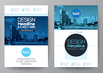
Choosing the Right Images
While you can have text only brochures, images are a great way to create impact. The adage ‘a picture tells a thousand words’ still rings true which is why choosing the right shots is crucial.
It’s ok to use appropriately licensed stock images if you don’t have your own high-resolution image library to draw from but you want to choose high quality images that elicit the right emotional reaction from your target audience.
If you aren’t sure how much impact a single image can have, google Apple advertisements. They are the masters at using minimal words – sometimes as few as six including the product name – and a large product photo. Obviously the brand and their products are ubiquitously known but their brochures, posters and other advertising materials are still very effective at communicating their key messages.
Simple Messaging
Whether you’re designing a postcard size flyer or a fold out DL brochure, it’s important not to put too much information in there. You want to introduce yourself to your clientele, not overwhelm them.
It’s also important to include a clear call to action. What do you want people to do when they finish reading your brochure? It’s important to spell out their next steps in their journey and ensure your design is drawing their attention to the right details at the right time.
If you need some help incorporating our tips into your next brochure, you can utilise our in-house design service. At Southport Printing Co., we have a creative team of experienced graphic designers who can work with you to ensure your flyers don’t just look great but also get results. We offer affordable rates and fast turnaround printing nationwide from our Gold Coast premises. Contact us today.